A Quick Introduction: Getting it right from the very beginning.
We’ve all been there. The endless email chain: “Can you move the logo one millimeter to the left?” “This color looks darker than the last sample.” “The file you sent is corrupt, could you send it again?” These seemingly small communication hiccups are the single biggest source of delays, frustration, and costly mistakes when working with a custom yoga mat manufacturer. They are the silent killers of timelines and budgets.
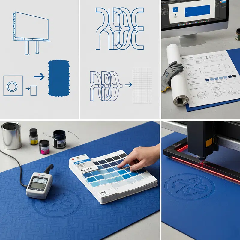
Think of it this way: a vague design file is like a blurry map. No matter how skilled our engineers are, they can’t reach your desired destination. But a professional, precise design file, often based on our design template, is a perfect blueprint. It’s a universal language that translates your creative vision into exact, actionable instructions for our yoga mat factory production line.
Don't worry, this isn't nearly as complicated as it sounds. Below, we’re sharing our insider’s guide—the exact rules we use to avoid errors and speed up production. This is a critical deep-dive into the "design preparation" step of our guide on how to customize yoga mats. Ask your designer to follow these principles, and our collaboration will feel less like work and more like magic.
1. The Heart of Your File: Why Vector is the Only Option
This is the most fundamental rule, and it’s non-negotiable.
A Simple Analogy
Imagine your brand logo is a “smart rubber band” defined by mathematical points. You can stretch it to the size of a business card or expand it to fit a giant billboard, and its edges will always remain perfectly sharp and clean. This is a vector file (.ai, .pdf, .eps).
Now, imagine your logo is a photograph made of tiny, fixed dots (pixels). It looks great on your phone, but when you try to enlarge it for production, those dots become visible, creating a blurry, jagged mess. This is often due to low resolution or insufficient DPI (dots per inch). This is a raster file or bitmap file (.jpg, .png, PSD, TIFF).
Why We’re So Strict About This
Our machines—whether for laser engraving, screen printing, or UV printing—don’t see images. They follow paths and coordinates. A vector file provides these precise paths. A raster file just provides a map of blurry pixels. Using a raster file for manufacturing will inevitably result in a low-quality, unprofessional-looking product.
What You Need to Do
Please ask your designer to provide the original source file created in Adobe Illustrator (.ai).
- Best Format: .ai (This is the master file with all layers and editing capabilities intact. We love this.)
- Good Alternative: Editable .pdf (When saving as a PDF, ensure the "Preserve Illustrator Editing Capabilities" option is checked.)
2. The Font Insurance Policy: Convert Your Text to Outlines
A Nightmare Scenario We See Daily
You’ve chosen a beautiful, unique font for your brand. It’s elegant and perfectly captures your brand’s spirit. You send us the design file. When we open it, a warning flashes on our screen: “Missing Fonts.” Instantly, your carefully chosen text is replaced by a generic default font like Arial or Times New Roman. The entire design’s layout and personality are destroyed in a single click.
What’s Happening?
Fonts are like software; they are installed on individual computers. The special font on your designer’s Mac does not exist on our production PCs.
The One-Click Fix
Luckily, there’s a simple, permanent solution. In Adobe Illustrator, ask your designer to select all the text in the file and press:
- Mac: Cmd + Shift + O
- PC: Ctrl + Shift + O
This command is called “Create Outlines.” It instantly converts your editable text into a fixed, unchangeable shape. It’s like pouring concrete around the letters—they are now locked in place forever. This guarantees your design will look identical on any computer in the world.
Pro-Tip: Always save a backup version of the file before creating outlines. That way, if you ever need to change the wording, you still have an editable text version.
3. The Universal Language of Color: Specify Pantone (PMS) Codes
We’ve arrived at the most critical and often misunderstood topic: color.
The Great Screen Color Lie
The blue you see on your iPhone, the blue on your designer’s Dell monitor, and the blue on our yoga mat factory’s calibration screen are three different blues. Screen brightness, brand, age, and even the ambient light in the room can dramatically alter how a color appears. This discrepancy often arises because the color mode of screens (RGB) is different from printing (CMYK). Relying on screen colors for manufacturing is a recipe for disappointment.
The Gold Standard
The Pantone Matching System (PMS). Think of Pantone as the international passport for color. Each code (e.g., “PMS 286 C”) corresponds to a single, globally recognized color with a precise ink formula for creating it.
What You Need to Do
Please ask your designer to assign a specific Pantone Solid Coated code to every single color element in your design. Instead of just picking a blue that “looks right,” they should use Illustrator’s built-in Pantone library: Swatch Libraries > Color Books > PANTONE+ Solid Coated.
- What does the “C” mean? It stands for “Coated,” which represents how the color will appear on a smooth, coated surface—very similar to the surface of our yoga mats.
When you give us a Pantone code, our ink technicians are no longer guessing. They are following a scientific formula to mix the ink, ensuring the final product’s color perfectly matches the physical Pantone color swatch. This removes all subjectivity and is the only way to guarantee color accuracy through precise Pantone matching.
The Pro-Level Touch: Adding a Simple "Tech Pack"
Want to elevate your design file from good to great? Add a small, simple set of notes on the side of your artboard. This transforms your file from just a design into a professional manufacturing instruction sheet with clear artwork specifications.
- Product Dimensions: e.g., Length 1830mm, Width 680mm, Thickness 5mm.
- Logo/Pattern Placement: Be precise. e.g., "Logo center point is 150mm from the top edge, horizontally centered."
- Color Key: List all Pantone colors used. e.g., "Main Mat Body: PMS Cool Gray 1 C, Logo: PMS Black 6 C."
- Process Notes: Tell us your intent. e.g., "Logo to be laser engraved for a subtle, debossed effect," or "Pattern to be screen printed."
- Bleed and Trim Lines: If your design extends to the edge, specify a bleed area (e.g., 5mm) to ensure there are no white borders after cutting. Note the trim lines for final size.
Final Thoughts: Think of Us as Your Technical Partner
If all of the above feels a bit overwhelming, please do not worry. This is precisely why we are here. We strive to be the best yoga mat manufacturer by guiding you through this process. Your expertise is in building a brilliant brand and creating a beautiful vision. Our expertise as a leading custom yoga mat manufacturer is in navigating these technical requirements to bring that vision to life, flawlessly.
So, if you or your designer are ever uncertain about a document, the best thing you can do is send us what you have. We are more than happy to review your draft, offer feedback, and help you optimize it for manufacturing. Remember, we are not just another yoga mat supplier awaiting instructions; we are your technical partner, fully invested in your success. When you're ready, contacting us with your files is the best next step. Let's work together to turn that perfect blueprint into an amazing product.


